
In 2015, mobile internet usage has crossed the computer usage for the very first time. As per increasing trends of the same, Google’s Algorithm, “Mobilegeddon” mentioned that each website needs to maintain a mobile-friendly website and if it fails to do so, it will decrease the site’s ranking in the search results of mobile devices.
Mobile users undeniably desire an optimized website for their mobile devices and most of them simply don’t return back to a website if the same doesn’t load properly on their mobile devices. Therefore, having a mobile-friendly website isn’t just an additional feature to your overall website; instead, it’s an essential requirement that is demanded its success. To get through the process of how to make your website mobile friendly, The Jigsaw SEO brings you some tips:
Mobile users undeniably desire an optimized website for their mobile devices and most of them simply don’t return back to a website if the same doesn’t load properly on their mobile devices. Therefore, having a mobile-friendly website isn’t just an additional feature to your overall website; instead, it’s an essential requirement that is demanded its success. To get through the process of how to make your website mobile friendly, The Jigsaw SEO brings you some tips:

- Don’t make separate Mobile Friendly Website: Formerly, for the “mobile web,” designing website was done by shortening the content so that it may fit into the small mobile screen. But this isn’t an appropriate way of managing a mobile-friendly website as we can’t interpret that what kind of content the users want and accordingly shorten your data.
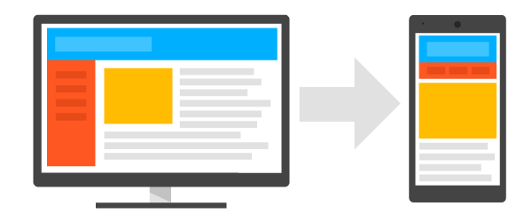
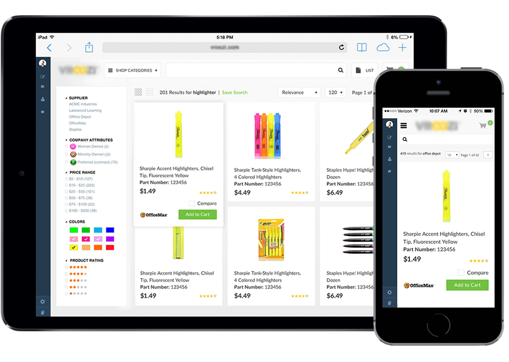
Google penalizes us for duplicated content; therefore, having two websites—one for mobile and other for desktop published with the same content eliminates the purpose of you being uniquely popping on Google’s search engines. So, you shouldn’t make another website for mobiles users. - Make your Website Responsive: A responsive website includes the same content and presents the same data on any device. It just changes the way it is displayed depending upon the size of the device screen. It may scatter the information at the desktop screen and confine it in a mobile screen. This is the best option which you can opt for making your website mobile friendly. Through this way, you won’t be shortening the information that you will be providing through your mobile-friendly website and henceforth, your users will get the same content on each of their device. Above that, a responsively designed website is also good for SEO.
- Portray your Information Easier and Simpler: Some people want to browse their information as soon as possible. Think about the information you would want as a viewer on your mobile device? What is the most likely information that you are looking for? When you navigate a website, what you want to be displayed initially? Based on this survey, put that information or links with the appropriate description on your mobile’s website homepage.
Also, consider the FAQs that your viewers post and expect to be easily displayed on your website. It might not make sense when you try to answer all of them positively but you should make an effort to resolve every person’s problem by simplifying it out to the maximum level so that they can easily navigate your website through a mobile device. - Include Viewport Meta Tag: By using the viewport Meta tag, you can easily control how to show your website on a mobile device. The viewport provides a virtual area which is used by the browser that renders help to search engine to determine how the content should be scaled and sized. If your page tends to open up with the same width on mobile as that of your desktop, you would need to scroll so much for appropriate reading. The viewport Meta tag is used to basically tell the browsers to fit the width of your page to the screen of the device type and create a comfort level for the visitor to navigate and read your data. To simply it, add this HTML code to each of your pages:
<meta name=”viewport” content=”width=device-width, initial-scale=1″> - Use large Font Size: Reading on a small screen with small fonts will be tough. It’s better to use a good sized font on your web pages so as to ensure comfortable reading. You can also test that out how it looks. Also, it’s best to go on with standard fonts.
- Use High-Resolution Images: High-resolution images are extremely important for your responsive designed websites so as to ensure the high standard experience of your user. The latest models of iOS and Samsung devices have high definition screens that actually require a good HD image. Having extremely high-resolution images will help you to avoid having blurry images when they are zoomed in.