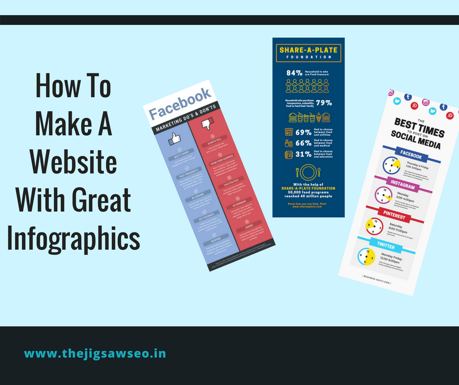

1. Create target-specific infographics
The common mistake that many people out there make is that they try to be as inclusive as possible when it comes to their infographics. However, what goes wrong with such infographics is that they fail to deliver the necessary information.The infographics that generate good traction, attention, and virality are the ones which find the target audience with ease.Do not try going for something very generic. Rather, try going for something more relevant to your audience.
2. Aim at simplicity
We might be lured into the idea of conveying as much information as possible through the infographic. Yet, you have to remember that your task is to make the cognition simple rather than creating a complex impression in the mind of the audience.Keep it simple and the infographic will work very well.
3. Keep it focused
How do you achieve the simplicity that I talked about earlier? Simplicity can be achieved by keeping the focus of the infographic clear. Refrain from throwing too many facts and figures. Instead, give streamlined flow to your infographic. Infographics aren’t meant to convey just set of facts but a point that you wish to make the facts. Be clear about this point well and work towards it systematically.
4. Achieve balance
The key to making a visually appealing infographic is the perfect balance of the ‘info’ and ‘graphics’ part.Visual elements like icon, images, graphs, create a better impression on the mind of whatever point you want to make.
5. Promote it well
Infographics won’t go viral by themselves. They are going to need an initial push from your side. Promote your work like any other piece of content on social media platforms. Make the most of plugins. Ask your users also to share these. You can also reach out to influencers and ask them to feature your infographic.
6. Make it easy and convenient to view
The readability of your infographic needs to be maintained throughout. The designer might make a huge one and then the developer has to downsize it depending on the loading speed that he targets. In this process, the readability of the infographic can be lost.
This means that you need to make sure that the smallest of your font sizes are visible without much problem even after the possible resizing
7. Make the dimensions manageable
Infographics are inherently long. That is how they are usually supposed to be but they shouldn’t be too long. If that happens, your users will start losing interest and might so happen that your main point isn’t conveyed properly. A limit length of about 8000 pixels should be fine.
8. Create a catchy headline.
Headlines will make first impressions. Just like any blog article, an infographic will also require a catchy headline. Some features of good headlines are as follows:
Describe the main point of the infographic.
Grab the attention of the viewer.
Short enough and not complex.